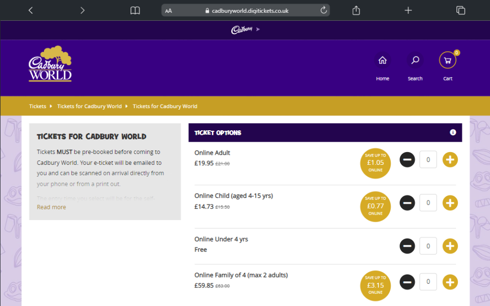

Our wonderful design and development team have been hard at work over the last few months, building a fancy new front end layout for the ticketing pages!
The new format has been designed to streamline the booking process, improve conversion rates, and to bring the finished product bang up to date, while still reflecting the client's branding.
With a funky blocky layout and a real emphasis on images the styling is really user friendly, grabbing the customer's interest and making it as quick and easy as possible for them to book the tickets they want. The best part is that it's still evolving, so we've got lots of exciting new features to look forward to!
Lots of clients have already moved over to it, and we're really loving how it's looking on their sites - why not check out a few below?
Want to learn more?
Get in contact with us to discuss how we might be able to help.


